Draplin vs.America

Just noticed this was missing too...gee-wiz!!!assignment 1(type paterns)

this would be a screen-shot of my process

Bickham Script pro2

this is Gisha

Bickham_Script_Pro2_color
I think that Bickham Script pro is my favorite font. It is just so delicate and beautiful.

Much better. Still needs some TLC, with consistency and colors.

Oops...image book!

So for our 5th and final assignment in art 120 we’re asked to create an image book that consist of an object-of our choice-then to produce that object with multiple variations (like 30+ times!!), using both technology and our ‘good-old-trusty’ hands and a variety of mediums.
When Kate introduced this assignment, I was elated. Oh, how I patiently waited to do an assignment that allowed me the freedom to see through the eyes of a child. “Make the image from whatever,” Kate says, about the handmade portion of the assignment. I felt like a Toy’R’us kid all over again, wide-eyed and all! I rate this assignment with Big-Snaps-in-Z-formation!
So, without further a-do…
…the One…
…the Only…
…El Hando de Gavin!

Process?!? Hmmm, an image for the book huh?…had some ideas-to some extent- about the genre of my image (my children’s art). I just had to find it amongst all the other drawings and artwork I saved over 6+ years.

The first treatments I created, were achieved with the use of Photoshop (or in some cases, illustrator);

COMPUTER GENERATED IMAGES!
Extract background/Created a new background for object/Combine a handmade treatment with a computer treatment.

Halftone

Super contrast / brightness
Blended two objects
Pop art

Totally deconstruct your image, transform tool explore
The next are hand created by yours truly, and her little-BIG helpers!
[p.s. Thank you kiddos, for helping mommy have a blast doing her homework]

HANDMADE:
Collage (cut out, ripped up, glued together hand images)

Chalk
3-D illustration-clay

Awe…bananas!

Moss is boss

Macaroni noodles, painted w/ color pigments
Is this a Star Trekie wave? Or is it just, plain Grrreat?

Mod City


1. Start with a rectangle of blue on the first layer. Lock the layer. Create a new layer.

2. Change the color to yellow. On the new layer using the Pen tool, draw a cityscape in the negative space.
3. Use the Pen tool and draw in the shapes seen below making sure to change colors as necessary.
4. Change to dark gray and draw in a street as shown below.
5. Using the same yellow, draw in a center line for the road then change to the Knife tool and make cuts. Use the Direct Selection tool and delete the little sections.

6. Change to the background blue and draw in the details on the buildings.
7. Draw in the highlights and shadow areas.
8. Draw in the sun with the Ellipse tool.
9. Change to orange and the Pencil brush. Set in some detail in the sky with a Stroke weight of 3 pt.
10. Change to Stroke and the dark blue in the picture. Add lines in places.
11. Finally, using a 2 pt. stroke, add in white and black lines, then change to a dark blue and add a couple of shadows by the buildings.

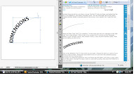
Use the blend to add dimension to your text.

1.The first thing I had to do was draw a curve, and select the Pen Tool, and draw a smooth curve.
2. the Path-Type Tool by click on the curve. Then typed away.
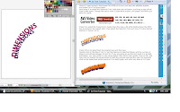
w/ the Selection Tool, i Changed the color of my type to bright pinkish/purple.
3. made a copy of the type, set the copy a little down bellow the original text. Changed the copy's color to dark purple, and send it to back.
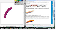
4. selected both the original type and the copied text. Double clicked on the Blend Tool

5. clicked on exactly the same points on both the original type and the copy (for example clicked on the lowermost anchor point on S on both types, and done! I now have 3-D type
http://www.tutorialguide.net/3d_text_tutorial.html

Learn How to Create Vector Fire

1. Create a document that is 8.5 inches by 11 inches. Double-click on the Pencil Tool from the Tools Panel to bring up the Pencil Tool Preferences dialog. In the dialog change the Fidelity to .5.
2. With the Pencil Tool, draw a flame shape that is roughly 8.5 inches tall by 5 inches wide. Then fill it with black. Make sure that the Paths are closed by pressing Alt before finishing drawing the shape.
3. Draw another flame shape within the first one, making sure not to overlap the shapes (sometimes this causes the Blend not to work properly). Once you have finished drawing and closing the shape, fill it with an orange color
4. Draw another flame shape within the previous one, and fill it with a yellow color. Keep in mind you want the path closed and not overlapping the other paths.
5. Draw another flame shape within the previous one and fill with a light yellow.
6. Now that all the flame shapes are drawn, select all the flames and create a Blend by going to Object > Blend > Make.

http://vector.tutsplus.com/tutorials/illustration/learn-how-to-create-realistic-vector-fire/

How to Use Effects to Create a Cool Design

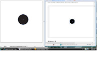
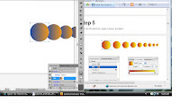
1. Started out w/ creating a new document, then created a black circle.
2. With my circle still selected, applied the transform effect (Effect -Distort & Transform -Transform...).

3. Again w/ the first circle still selected, I chose a gradient fill color, and applied a linear gradient.

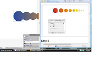
4. My circle still selected, moved the transform effect's layer to the top of the list. then a second transform effect.

5. added a 75% Fisheye Warp (Effect -Warp -Fisheye) then moved the Warp layer all the way down on th effects layer list.

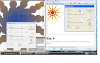
6. Added the twist: Effect -Warp -Twist.

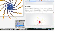
7. dragged the whole object to the Graphic Styles palette and created a black rectangle shape elsewhere on the artboard, applied the style to it by just selecting the rectangle and click on the style in the graphic styles palette.


http://vector.tutsplus.com/category/tutorials/page/9/

Creating Road Maps in Adobe Illustrator

1. began w/ drawing a straight line (using hold Shift) on my new document.

2.Copied and pastde the line back into place (Ctrl / CMD + F), and change the weight to a thinner stroke and colour in white.

3.
Selected both of the objects strokes and clicked the 'New Brush' icon in the brushes window.

http://www.webdesign.org/web/vector-graphics/adobe-illustrator/creating-road-maps-in-adobe-illustrator.16104.html

How to Create a Mosaic Portrait from a Photograph

1. Created a new document 400 pixels square. It can be RGB or CMYK.
2. Place a photo into the document. For this illustration, I'm using a tightly-cropped square portrait. Uncheck the Link button, in the Place dialog, so the photo will be embedded. If you forget this step, simply go to the Links panel and embed the image.

3. Make sure the photo is 400 pixels by 400 pixels. If necessary, you can resize it in the Control Panel. The beauty of this technique is that you can start with a less-than-perfect photo and get a nice result.
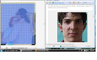
4. With the image selected, go to Object > Create Object Mosaic.
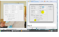
5. Enter one tenth the size of the full image in the Number Of Tiles section.
Since the image is 400 pixels by 400 pixels, the number of tiles will be 40 and 40. Check Delete Raster in the Options section.
6. Ungroup the mosaic. You should be able to select individual squares. Now go to Effect > Convert to Shape and choose Ellipse...
7. In the Shape Options dialog, enter 10 pixels for the Width and Height (400 pixels by 400 pixels, divided by 40 rows and columns). That's it, you're done!
8. For added touch, use Rectangle Tool, click once on the artboard, 400 pixels by 400 pixels for the size, fill it with black, and send it behind the mosaic.

http://vector.tutsplus.com/tutorials/illustration/how-to-create-a-mosaic-portrait-from-a-photograph/
.html